
We’re well into 2017, so it’s time to see if colour experts predicted on-trend colours correctly! It seems they did and what’s more, these colours tie in well together for a gorgeous colour palette for home interiors. Read on as we continue our fascination with neutrals and get to know some lush shades of green and blue.

Warmer Neutrals
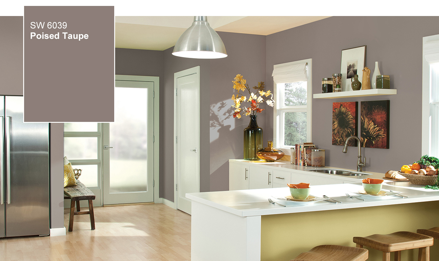
Neutrals are always a safe option because they take longer to date than other colours. But, the new neutrals are warmer than those of last year! Well-loved neutrals are branching out to include taupes, terracotta and pinks like blush and mushroom. These hues look amazing for painting plain walls, timber walls and even interior brick. In terms of atmosphere, think earthy and organic.
They are also a great backdrop for the rising trend of contrasting furniture to the walls, providing a calm background for a pop of colour. A combination of neutral tones can also work well in highlighting architectural details and adding depth.
Greys Are Evolving
Greys are still very popular but are evolving from pure greys to blended greys. Greige is coming to the fore, in keeping with the warmer neutrals that we love. This is a grey-beige blend that makes for a very versatile interior in terms of coordinating with both grey and brown shades.
Grey-blues are also a stand-out, evoking a sense of classic cool. Darker shades of blue-based greys are an evolution on the typical monochromatic interior when teamed with creamy whites.

The Greens Have It
Pantone’s Colour of the Year 2017 was a spot-on prediction for this year’s colour trend. Their zesty yellow-green shade called Greenery has provided inspiration for tropical shades of green to abound. A more subdued and sophisticated take on this trend is dark green, evoking a Scandinavian style. One thing is for sure – 2017’s greens are bold and full of life, so pale green is out!
Teal pops in
Energetic shades of blue-green provide an additional burst of colour to our favourites this year. In fact, this colour has recently been deemed the world’s favourite colour. So, it’s no surprise we see it making its mark on our interiors. Teal is beautifully calm, yet with a surprising warmth to invigorate your home’s interior. This progressive hue is perfectly paired with creamy neutral shades or deep grey.

Colour Psychology Is In
Colour psychology is nothing new, but in 2017 we see it being taken seriously. So, as well as considering which colours you like or are practical choices, colour psychology bases interior colour choices on how you want to feel in that room. The earthier neutrals and botanical shades we mentioned above will create an atmosphere of relaxation, harmony and rejuvenation. These shades are perfect for living areas. With grey representing safety and teal evoking calm, these colours are well suited to bedrooms.

Feeling inspired but don't know where to start? Message us, we'll help you out.
1800 WE PAINT or INFO@BCRPAINTING.COM.AU